A case study: Reviewed
Reviewed is your go-to place for all things, well, reviewed. People go to Reviewed to get fair product comparisons backed by scientific research. Look no further for nana’s next smart photo frame.
The problem
Reviewed, as part of the USA TODAY network, was growing rapidly and their team needed a single place for users to sign up for an expanding list of email newsletters.
The solution
There are several factors to consider when addressing a problem like Reviewed was facing. First up, who are the users we’re solving for? In this case, Reviewed needed a solution that delighted their customers and would be easy for their team to manage. That’s two primary user groups.
Next, it’s important to consider the unique needs of each user. Customers need a simple way to enter in their contact information and select the newsletters they want to subscribe to. However, Reviewed’s administrative team was less concerned about a streamlined newsletter signup process. Instead, they needed a simple way to manage their subscriptions and add new newsletter options in the future.
Finally, any addition to an existing user interface should match established design patterns. At the same time, it is my job as a designer to push the envelope. In this way, my aim for Reviewed was to achieve an appropriate balance of innovation and continuity.
Content CMS
(Reviewed Team)
Form Data
Front End
(User-Facing)
Newsletter
(Signup Form)
User Data
Email Service
Design
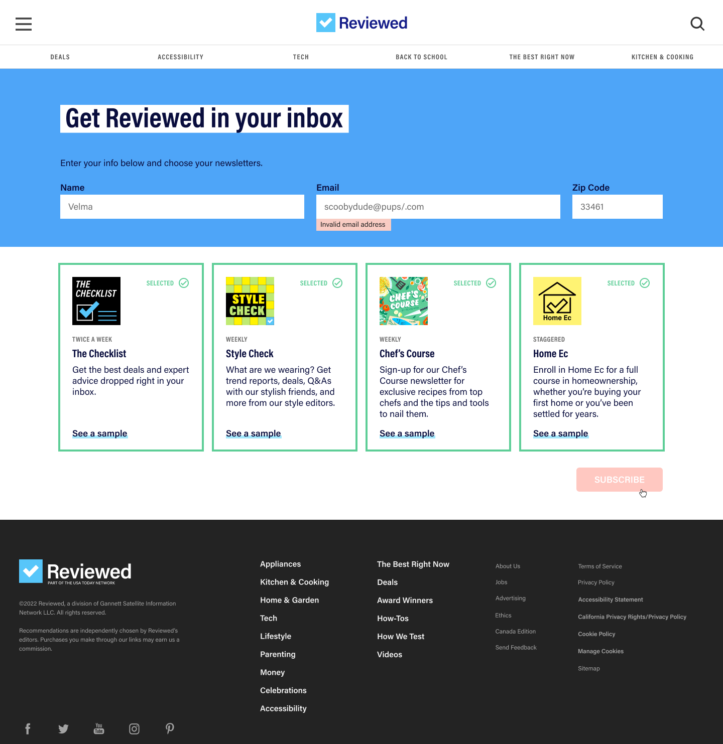
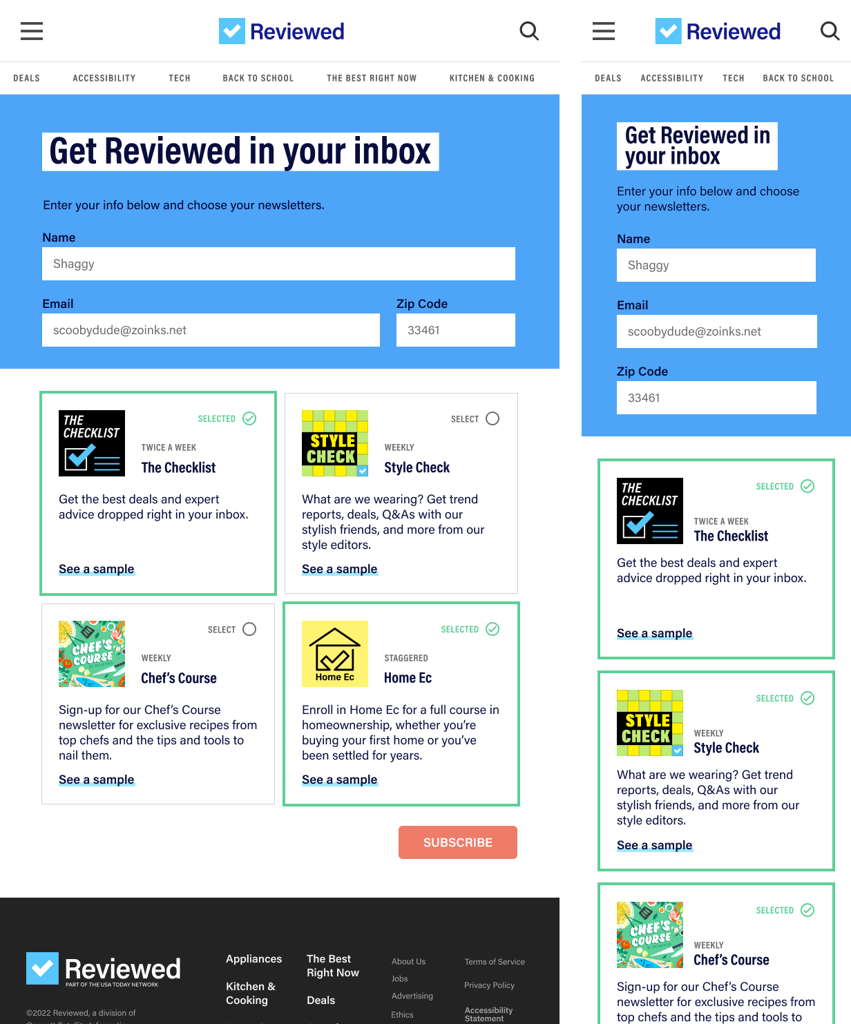
My first design task was to brainstorm several ideas for the user-facing components. After a few sketches and several drafts, I enhanced my design with important form states (first visit, errors, etc.), multiple screen sizes, and ensured that the final design was cohesive with Reviewed’s design system.


There are so many things I love about this design. First, these wireframes are distinctly "Reviewed" in terms of color, layout, typography, and messaging. It simply blends in with the rest of the site ... like a ninja. I’m also proud of the responsiveness of the design. This is a great example of thinking through how a user interface will change based on screen sizes and device types.
Engineering
In typical unicorn fashion, I had the privilege of implementing the design I created. Engineers at Reviewed were delegated the content management component while I tackled the front end. I created a Rails route, a view index, several view partials, and sprinkled in some stylish CSS alongside existing CSS variables. This laid the ground work for other engineers to plug in dynamic aspects of the content management and email service provider.
View Live PageLike what you see?
Well, you made it this far. It kind of seems like we should chat about how I can add value to your team. Don’t you think? (And yes, I read every message that comes through and respond promptly). Download my resume and drop me a line. Talk soon! 👋🏽